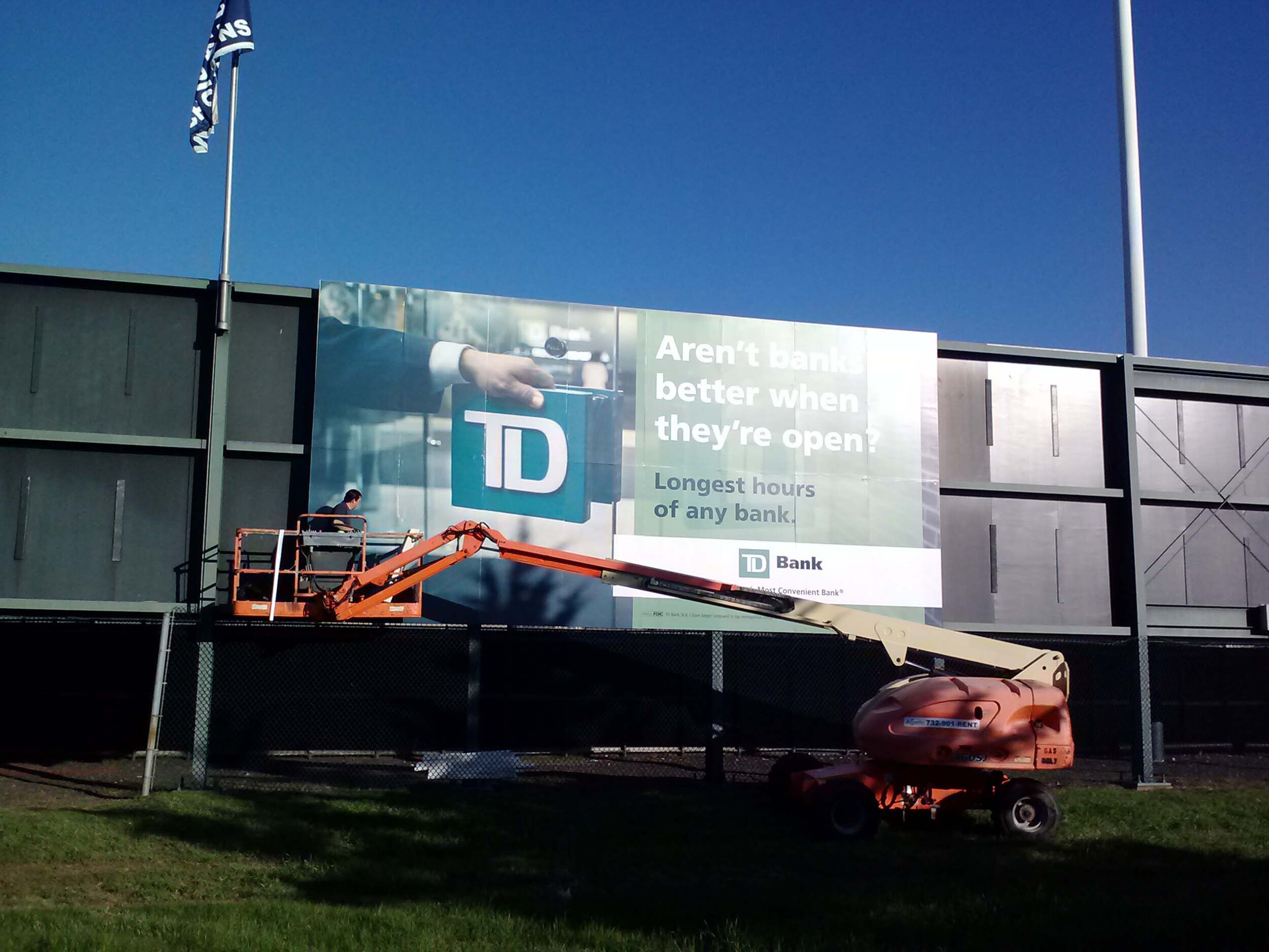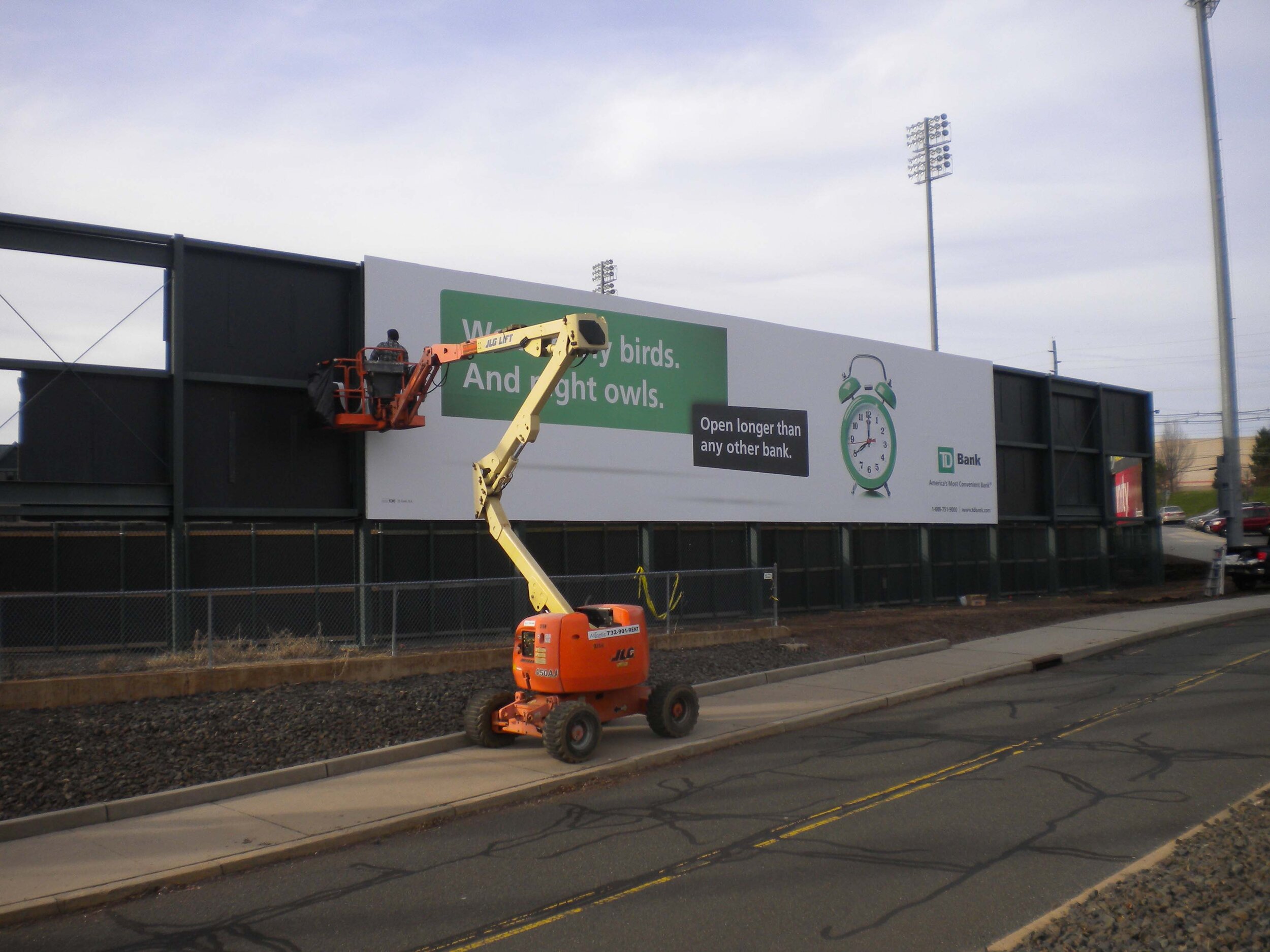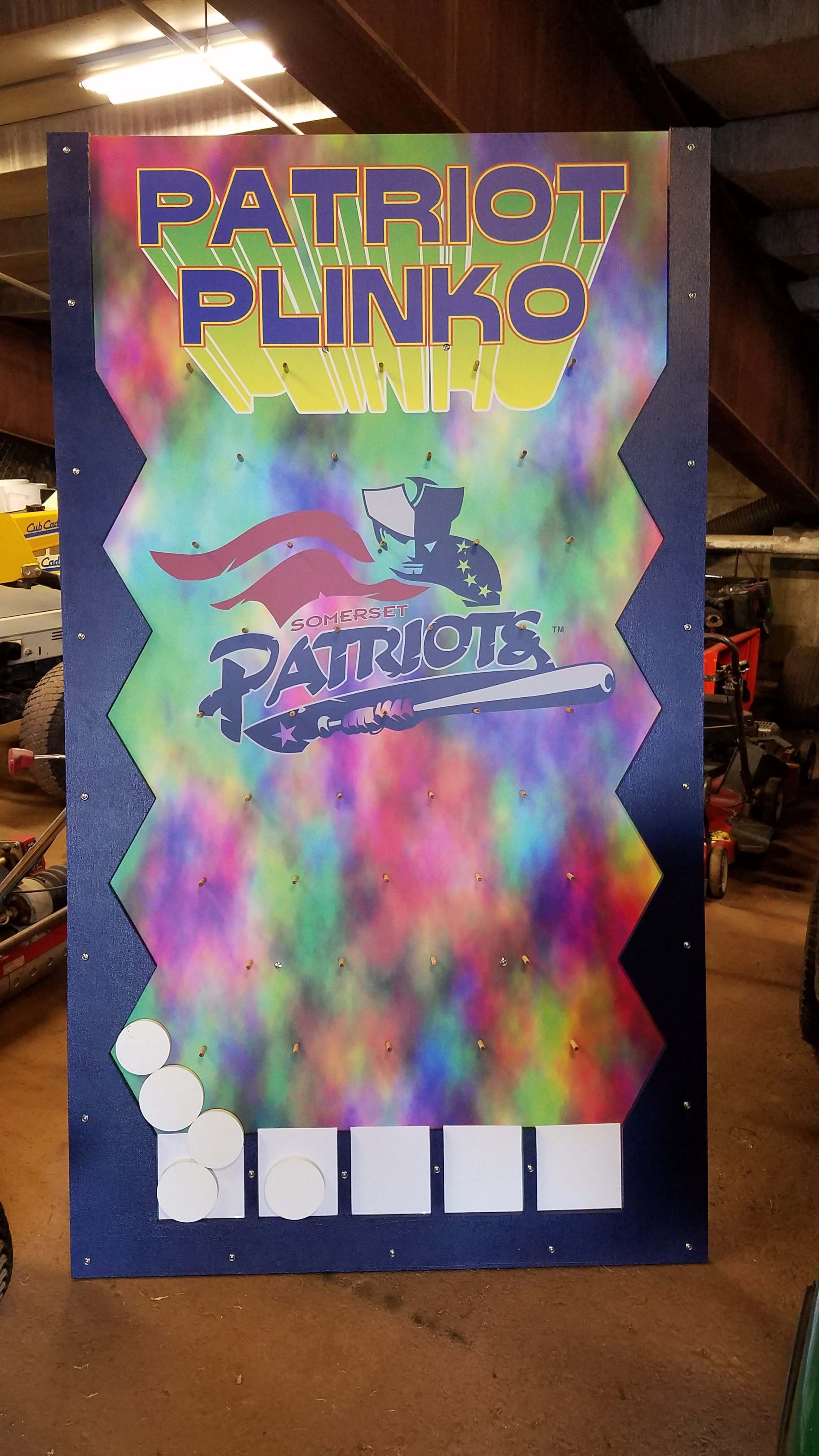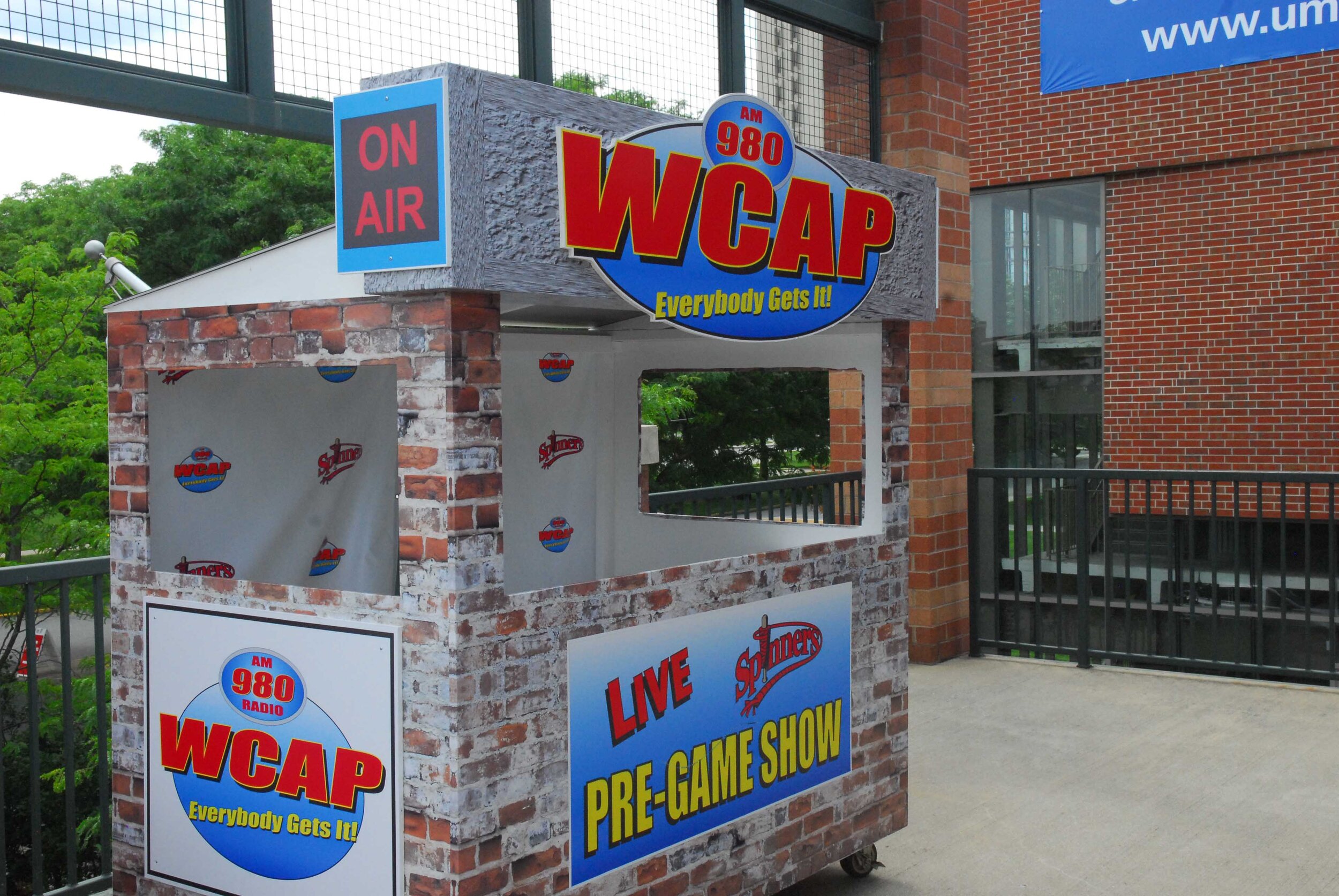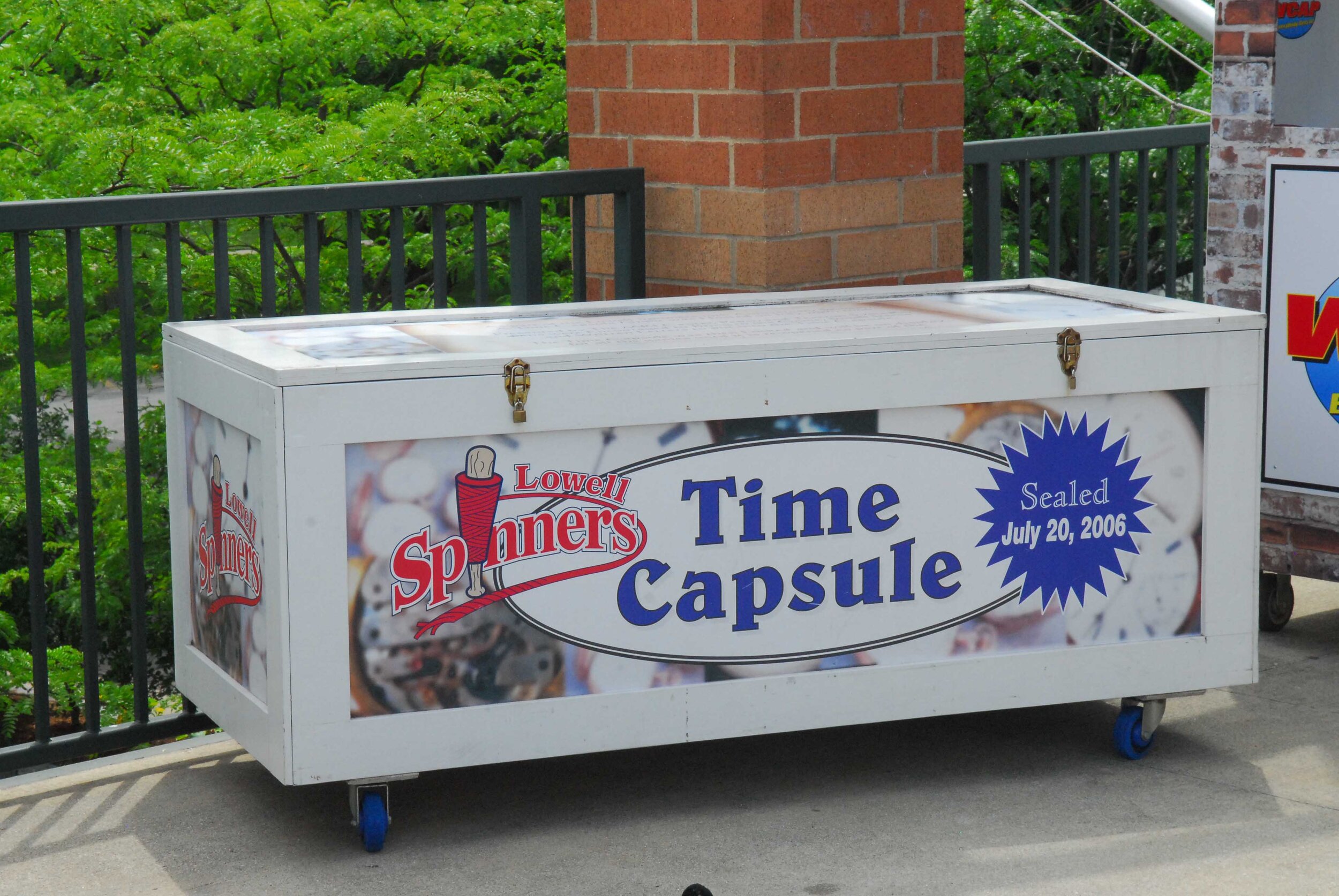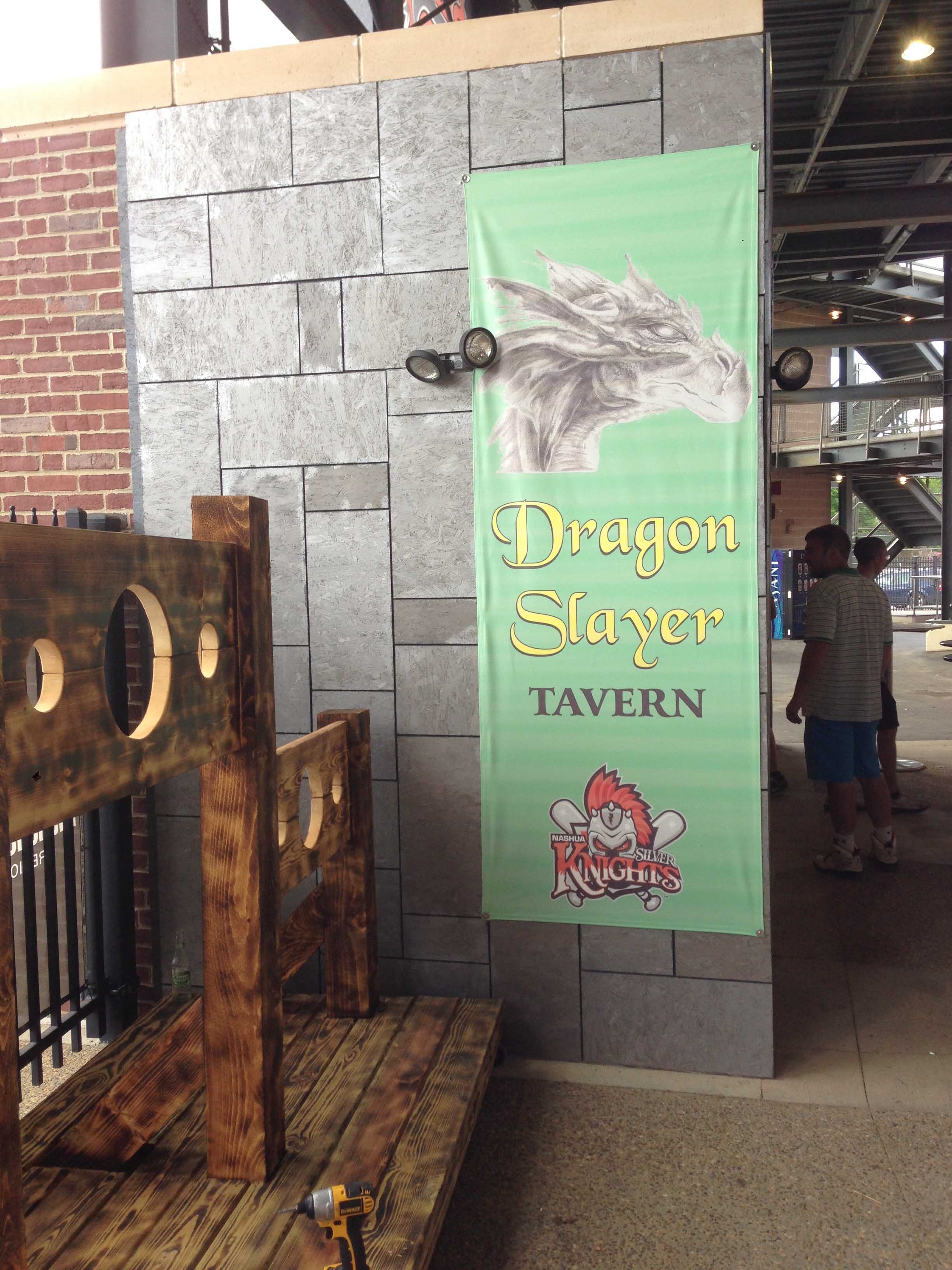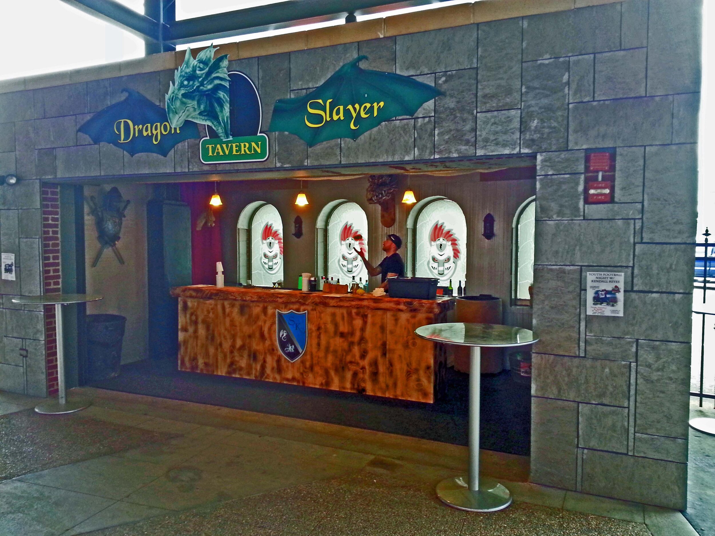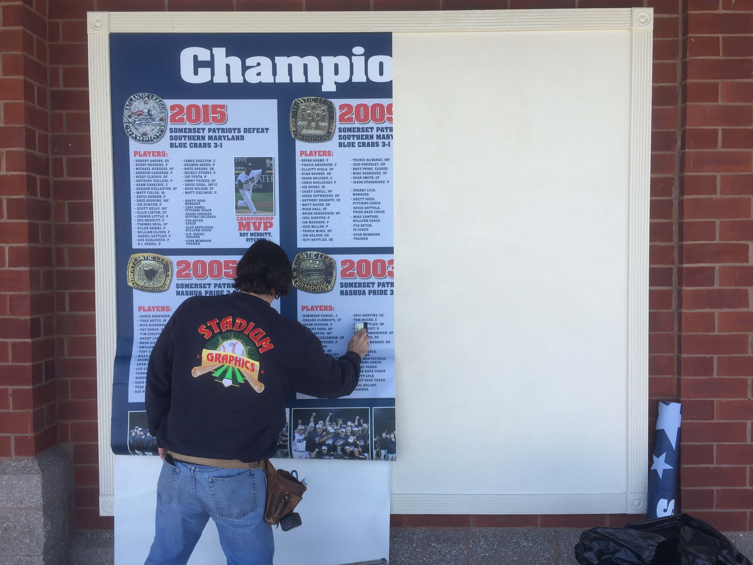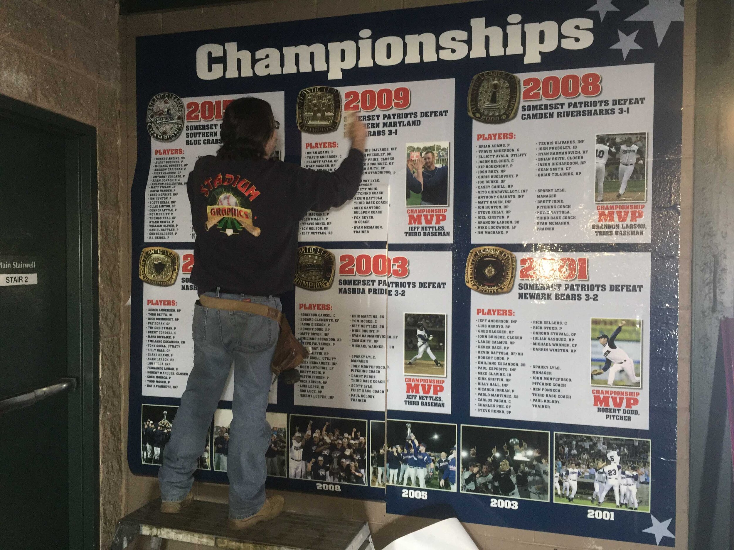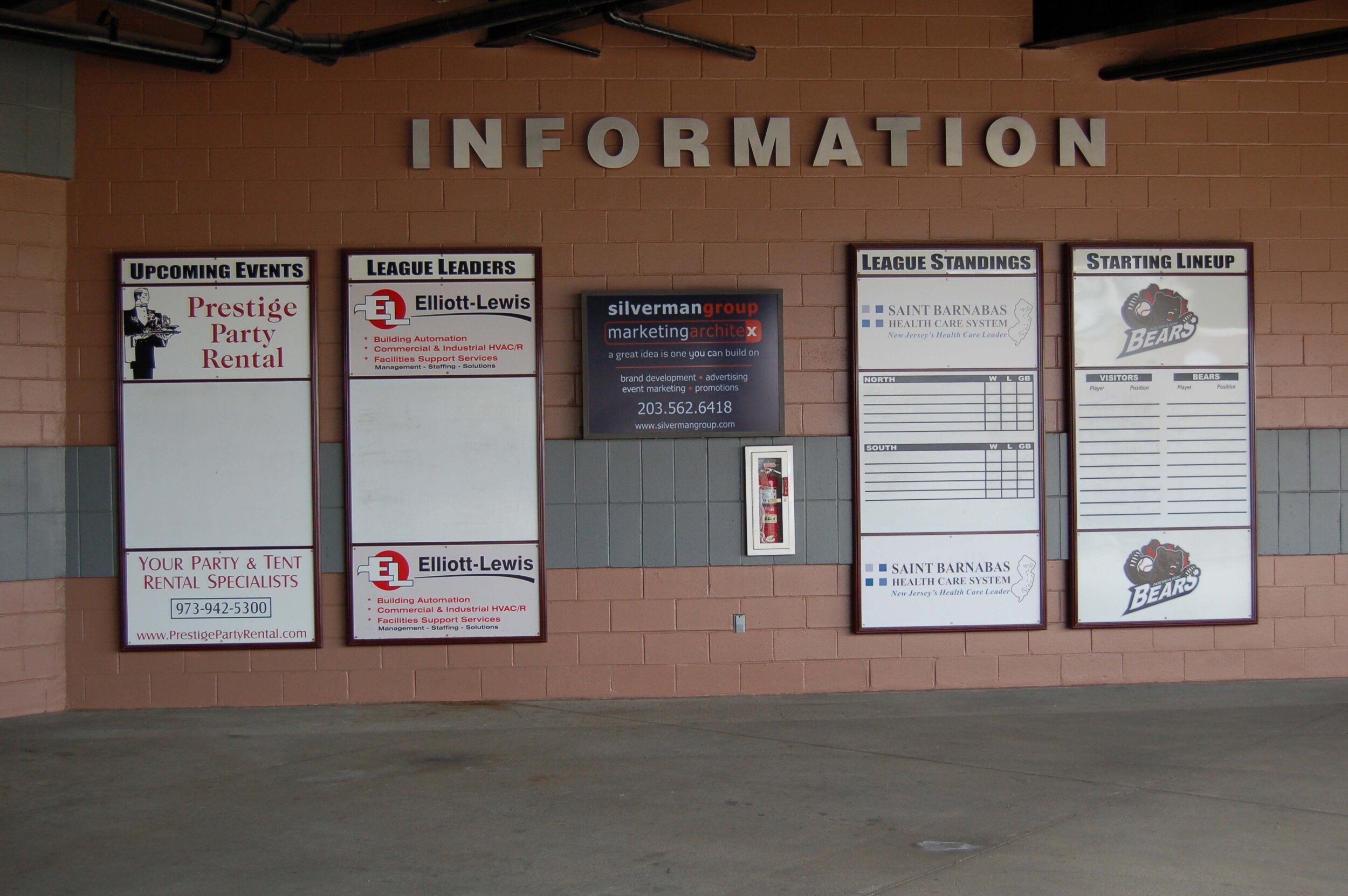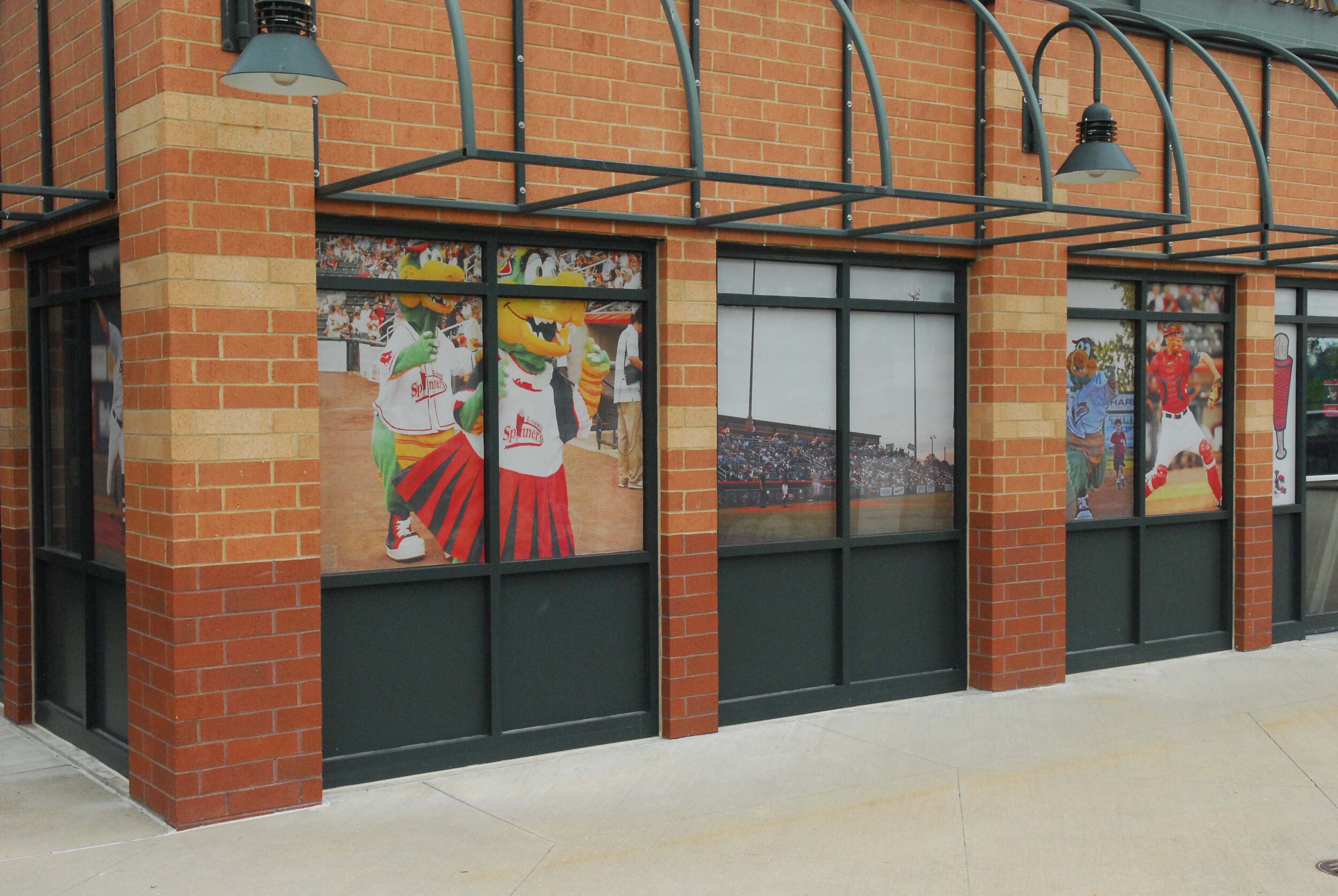
Stadium Graphics can create and install billboard signs in and outside of stadiums. If you do not have the means of creating artwork, send us information about your company (business, letterhead, pencil sketch, etc.) and our artists will help great a unique look for your sign.
Preferred File Types
.PDF, .EPS, .CDR are accepted file formats. No file larger than 100MB will be accepted. If using InDesign, please export as an Illustrator or CorelDraw file readable file.
Artist Specs
Ask your sales rep for active artwork size. Artwork size and sign size may differ. When creating or supplying files please outline all fonts. Please make document size proportional to sign size. Do not include any bleeds, crops, or marks outside the artwork area.
Stadium Graphics does not have on-staff photographers. All work including photography must be sent to Stadium Graphics ready for output.
Proofs of final artwork will be sent and approved before starting any work on a sign. Please give proofs your immediate attention and check for accuracy before signing off. Once a sign is constructed, it is a complex and costly procedure to make changes.
Stadium Graphics specializes in large format graphics with an emphasis on baseball parks. Through the years, we have designed and/or installed over 3000 outfield wall signs (and counting)! We bring our years of expertise and knowledge to help make sure your message is seen from anywhere in the stands! Browse to the right learn more about the process.
Suggestions
The first and most important rule in stadium advertising is KEEP IT SIMPLE!
It has been our experience that advertisers try to do too much when designing their advertising space. Prioritize information when adding graphical elements to your sign.
Avoid using complicated graphics and extensive text. The more you add, the less impact each element has when viewed from a distance. Try not to distract from the message you are trying to convey by adding unneccessary information If you need help during the design process, don't hesitate to contact Stadium Graphics.
The "400 Foot" Rule
If the lettering on an outfield wall or billboard isn't at least 8" in height, it cannot be read from the seats 400 feet away. We recommend 12" lettering and strongly recommend block style fonts whenever possible. The fancier the typestyle, the harder it is to read.
Colors
Colors make a big difference in legibility. Don't overwhelm your design with too many colors. High contrast colors (opposite ends of the spectrum), look best when viewed from 400 feet away. Setting similar colors next to one another looks great on paper, but the eye blurs coloring together when viewed from a distance.
If you need help or guidance from Stadium Graphics we are always happy to worth with you to produce the best possible sign. Feel free to call or email us with any questions.
